Gradio Layout Gym — Batch 1
Model: claude-opus-4-6 |
Date: 2026-02-08 |
Branch: learn-gradio (worktree at ~/all-code/rivus-learn-gradio) |
Gradio version: 5.x |
Screenshots: 66 across 11 variants
Executive Summary
4 challenges, 11 CSS variants, 66 screenshots at 3 viewport sizes (1400×900, 1400×600, 800×600). Each challenge tests a specific layout skill in isolation — Polya-style — with baseline (no CSS) vs 2-3 CSS approaches.
| Challenge |
Goal |
Best Variant |
Verdict |
| Ch02: Multi-Column Equal Height |
3 columns fill viewport, footer visible |
B (Flex) / C (Min-Height) |
Partial Footer locked, but left column content clipped |
| Ch03: Nested Tabs |
Tabs-in-tabs, content contained |
B (Flex CSS) |
Pass Footer visible, content scrolls within tabs |
| Ch04: Responsive Columns |
3→2→1 columns at narrow widths |
C (min_width=300) |
Pass Gradio native reflow works perfectly |
| Ch05: Sidebar + Main |
Fixed sidebar, scrollable main, footer |
C (Fixed 220px) — partial |
Partial Good sidebar sizing; needs viewport lock fix |
Top insight: The flex viewport cascade (overflow:hidden down the chain) is too aggressive for Markdown/HTML content in columns. It clips content instead of enabling scroll. Needs overflow-y: auto on the leaf content containers, not just overflow: hidden on parents. Use Gradio's native min_width for responsive layouts — don't fight it with CSS Grid.
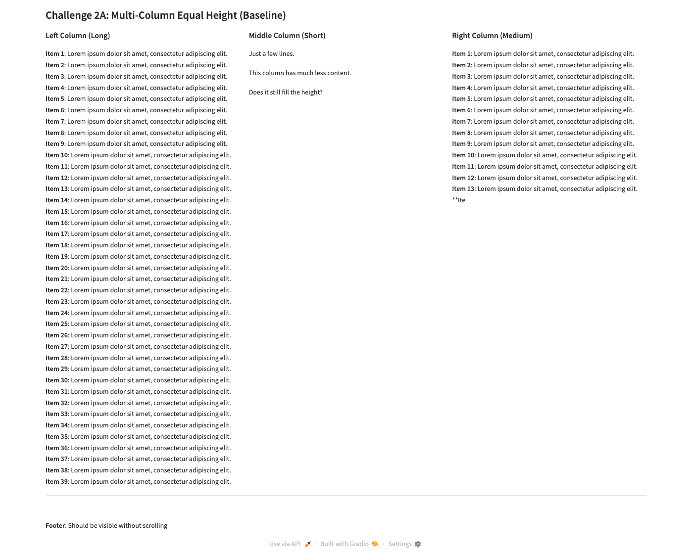
Challenge 2: Multi-Column Equal Height
Goal: Three columns of uneven content fill the viewport equally. Footer stays visible. No page-level scroll.
Why it matters: Dashboard layouts need side-by-side panels that don't push each other around when content varies.
Results at 1400×900
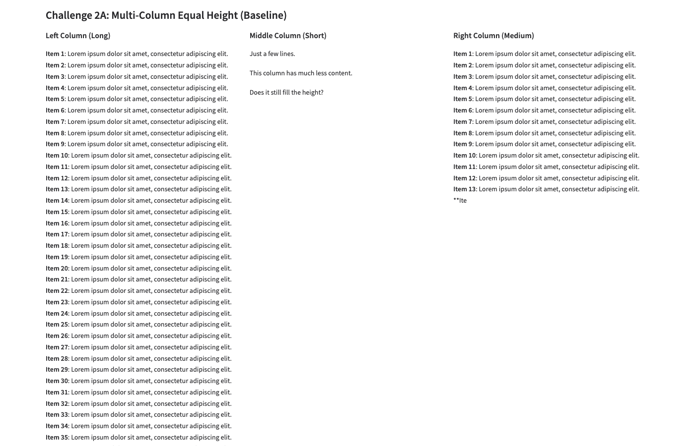
A: Baseline — All 39 items render in left col. Page very tall. Footer technically visible only at bottom of long page.
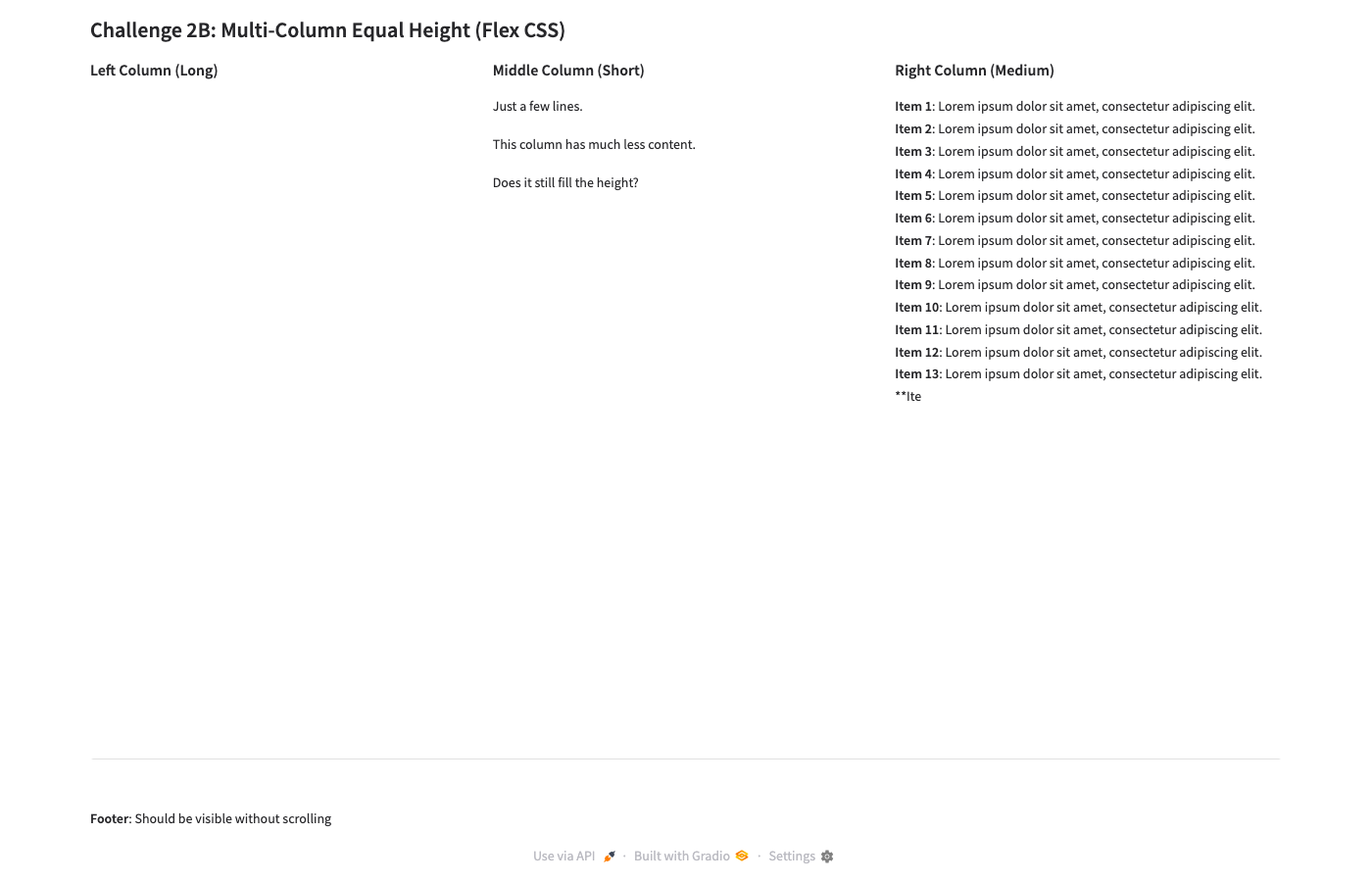
B: Flex CSS — Footer visible ✓. But left column content completely hidden! Only headers show. Right column shows ~13 items then clips.
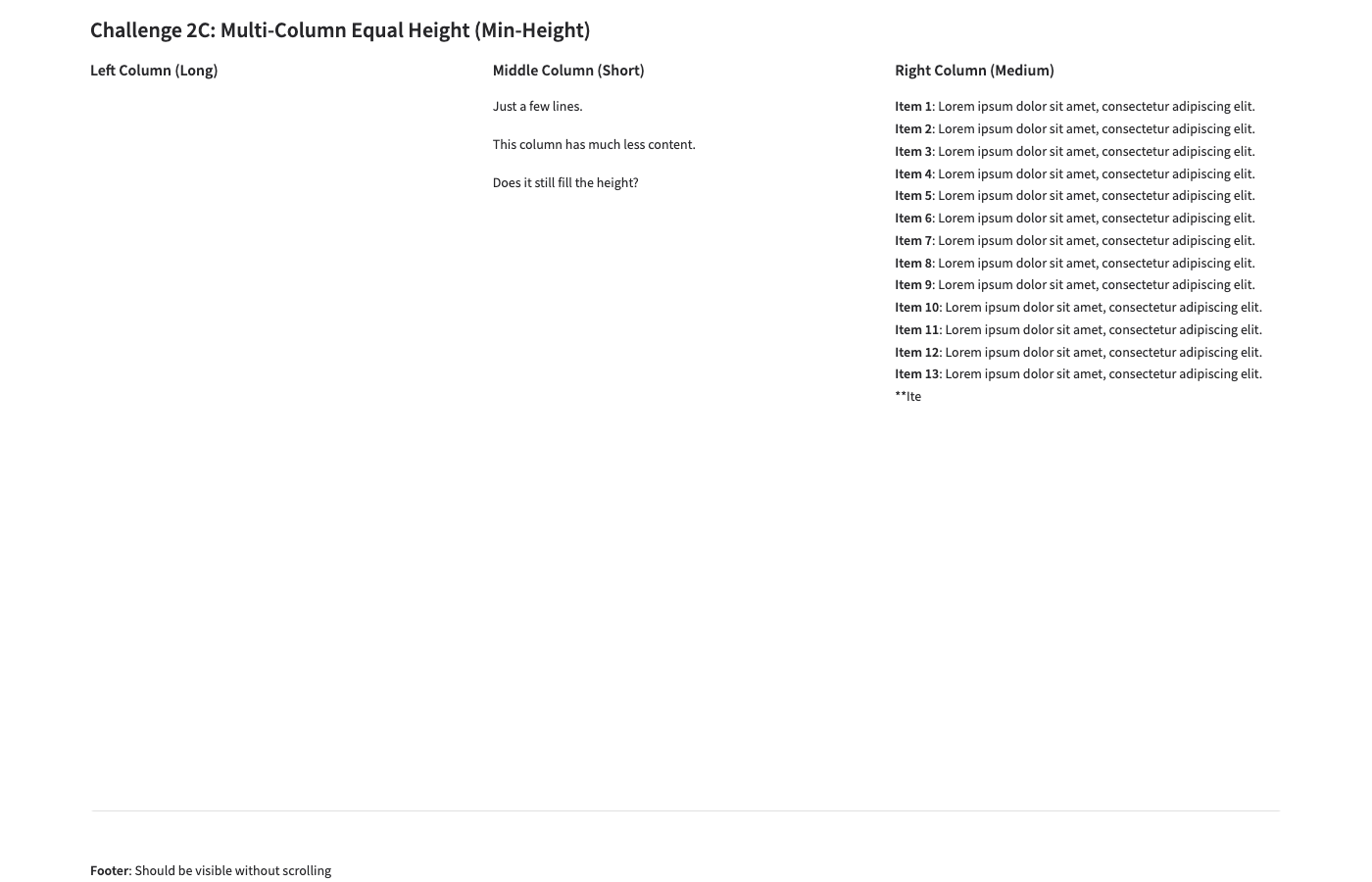
C: Min-Height — Nearly identical to B. Footer visible ✓. Left column content still hidden. calc(100vh - 150px) caps height.
Full-page comparison (A baseline — shows the problem)
A: Full page — Page extends far below viewport. Left column's 39 items force page-level scroll. Footer at the very bottom.
Problem: The flex cascade applies overflow: hidden to the row's children (the columns), which clips their Markdown content. The intent was that each column would scroll independently, but Gradio wraps Markdown in multiple nested divs — the overflow-y: auto on .equal-row > div targets the Column wrapper, not the actual content container inside it.
Fix needed
Target the deeper content container. Instead of .equal-row > div { overflow-y: auto }, need something like:
.equal-row > div > div { overflow-y: auto !important; max-height: 100% !important; }
Or use Gradio's elem_classes on the Markdown component itself to give it explicit scroll behavior. This is a follow-up experiment for Ch02-D.
Challenge 3: Nested Tabs
Goal: Outer tabs containing inner tabs. Content fills available space. Footer stays visible.
Why it matters: Brain app uses nested tabs (Extract/Vario/Reduce, each with sub-views). Content overflow in tabs is a real production bug.
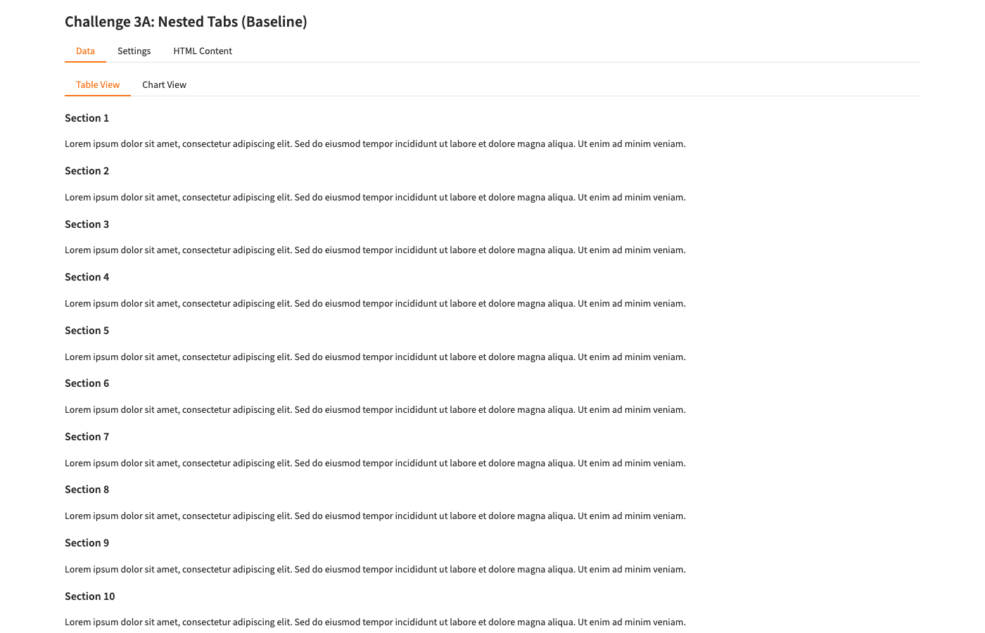
A: Baseline — Nested tabs render correctly. Shows sections 1-10. Footer NOT visible (pushed below by 24 sections of content).
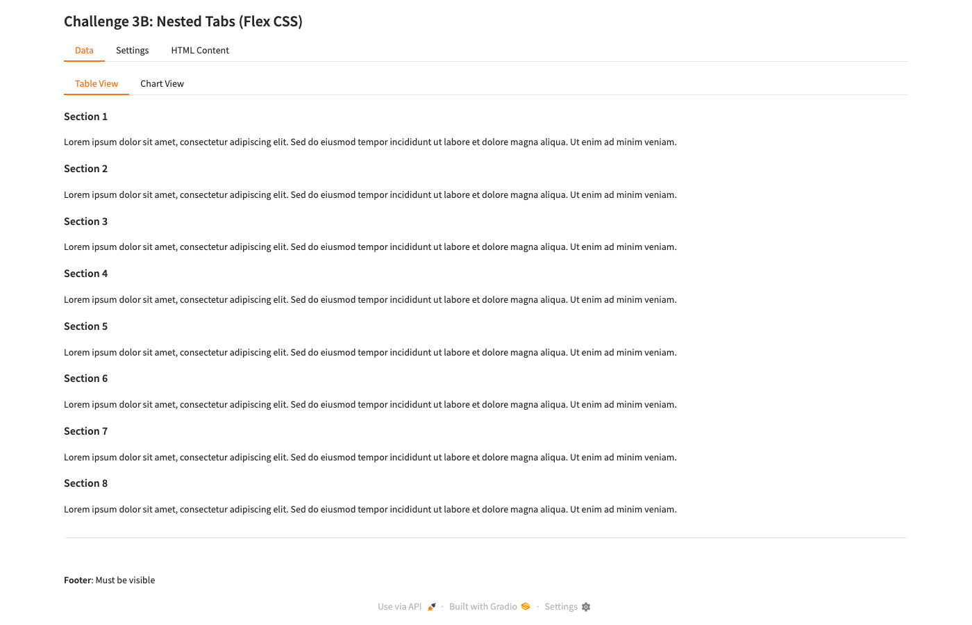
B: Flex CSS — Footer IS visible ✓. Shows sections 1-8 contained within tab area. Content scrolls within the tab panel.
Key finding: The flex viewport CSS works well for nested tabs with Markdown content. Gradio's Markdown component gets scroll behavior through the flex cascade — unlike raw columns (Ch02), the tab structure provides the right nesting for overflow-y: auto to take effect on the content panel.
Why tabs work but columns don't: Gradio's tab implementation (.tabitem) already has a more structured DOM hierarchy that responds well to flex cascading. Column content is flatter, so the overflow rules miss the actual content div.
Challenge 4: Responsive Columns
Goal: 6 dashboard cards in a grid that reflows from 3 columns (wide) → 2 columns (medium) → 1 column (narrow).
Why it matters: Dashboard layouts need to work on different screen sizes without custom breakpoint management.
At 1400×900 (wide)
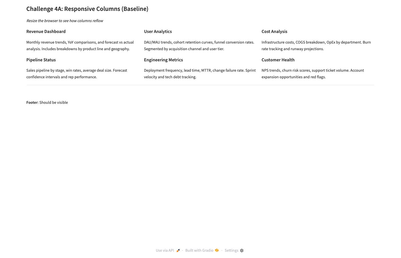
A: Baseline — 3 columns × 2 rows. Clean layout, footer visible. Gradio default works well here.
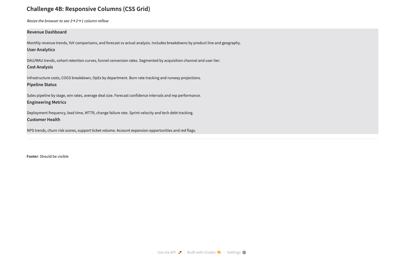
B: CSS Grid — Cards stack in SINGLE COLUMN at 1400px! Grid CSS doesn't override Gradio's internal wrappers. Fail
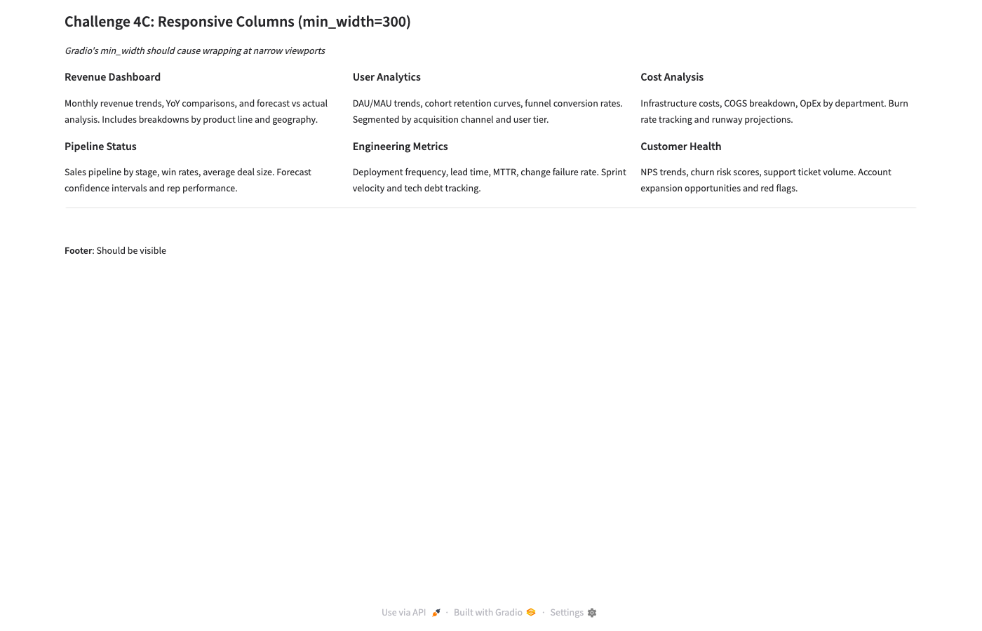
C: min_width=300 — 3 columns × 2 rows. Identical to baseline. Gradio's native layout works. Pass
At 800×600 (narrow — the real test)
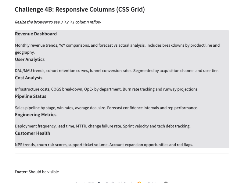
B: CSS Grid — Still single column. CSS Grid approach is completely broken with Gradio's component wrapper structure.
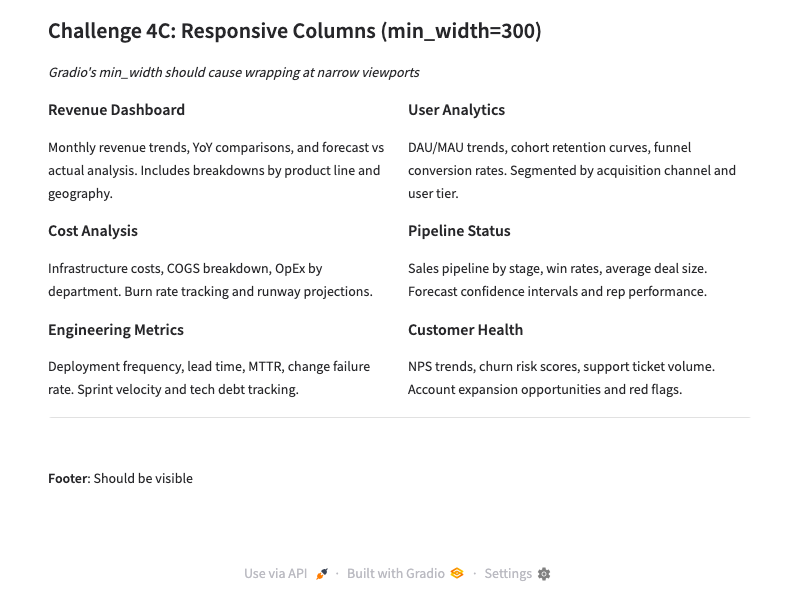
C: min_width=300 — Reflows to 2 columns × 3 rows at 800px! Exactly right
Critical lesson: Don't fight Gradio with CSS Grid. Gradio wraps each gr.Column() in multiple nested divs. CSS Grid applied to a gr.Group targets the wrong DOM level — the grid lays out Gradio wrappers, not the visual cards.
Instead, use Gradio's native min_width parameter: gr.Column(scale=1, min_width=300). Gradio handles the responsive reflow internally and it works correctly.
Challenge 5: Sidebar + Main
Goal: Fixed-width nav sidebar on the left. Main content area fills remaining width and scrolls independently. Footer stays visible.
Why it matters: Common app shell pattern. The sidebar (navigation, filters, controls) must stay visible while main content scrolls.
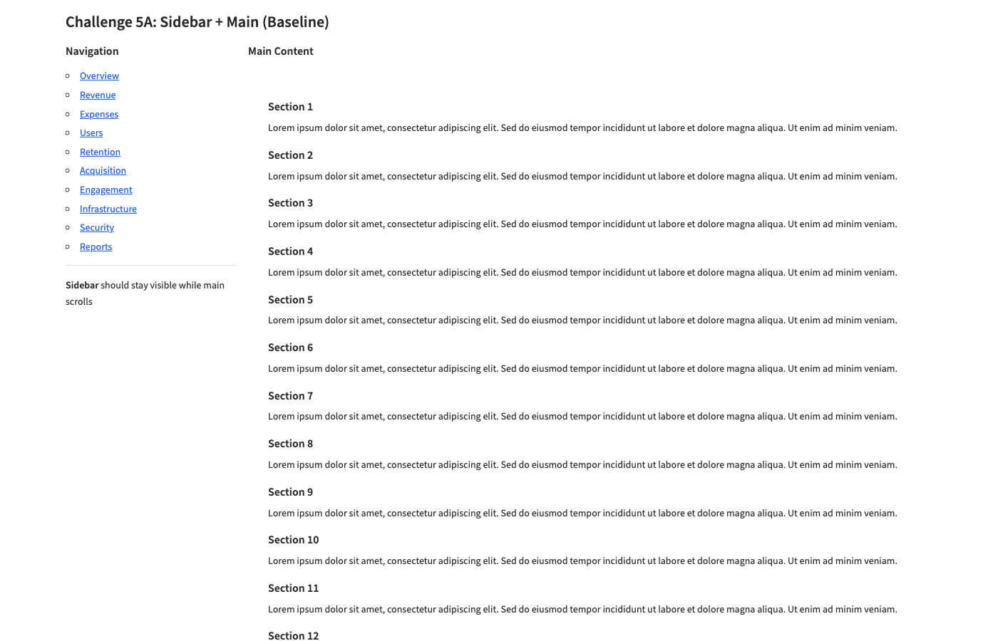
A: Baseline — Sidebar + main render correctly. But footer NOT visible — HTML content pushes page down. Same problem as Ch02-A.
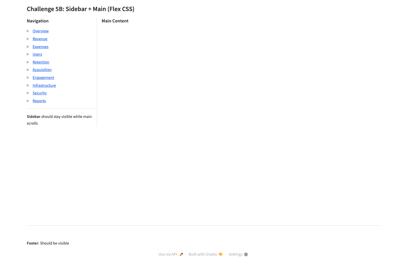
B: Flex CSS — Footer visible ✓, sidebar has border ✓. BUT main content area is EMPTY — HTML content completely clipped by overflow:hidden. Fail
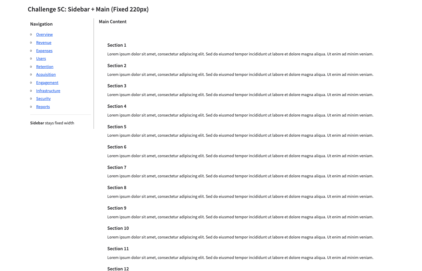
C: Fixed 220px — Sidebar at correct width with border ✓. Main shows 12 sections. Footer NOT visible (no viewport lock). Partial
Full-page B vs C comparison

B: Full page — Viewport-locked. Footer at bottom. But main content area genuinely empty — the HTML is clipped, not scrollable.
Same root cause as Ch02: The flex cascade's overflow: hidden clips gr.HTML() content inside columns. The CSS targets column wrappers, but the actual HTML content lives deeper in the DOM. Variant C proves the sidebar sizing works — it just needs the viewport lock from B with the right overflow targeting.
Fix strategy for Ch05-D
Combine C's explicit pixel widths with viewport locking, but apply overflow-y: auto at a deeper DOM level — targeting the actual content container inside the main column, not just the column wrapper.
Lessons Learned
| # | Lesson | Evidence |
|---|
| 1 |
Gradio's min_width handles responsive reflow correctly — don't use CSS Grid |
Ch04-C reflows 3→2 cols at 800px. Ch04-B (CSS Grid) renders single column at all widths. |
| 2 |
Flex viewport CSS works for tabs but clips column content |
Ch03-B: tabs + footer ✓. Ch02-B, Ch05-B: column content clipped by overflow:hidden. |
| 3 |
The overflow: hidden cascade is the #1 foot-gun — it clips content at the wrong DOM level |
Ch02-B (left column empty), Ch05-B (main content empty). Content is 2-3 divs deeper than the overflow target. |
| 4 |
Baseline Gradio handles short content well — problems only emerge with long/HTML content |
Ch04-A (short cards): perfect. Ch05-A (long HTML): footer pushed off. |
| 5 |
gr.HTML() and gr.Markdown() have different overflow behavior — Markdown gets some built-in containment, HTML does not |
Ch03-B: Markdown in tabs scrolls. Ch05-B: HTML in column clips. |
| 6 |
Full-page screenshots reveal the real truth — viewport-only shots can hide overflow problems |
Ch02-A viewport looks "ok" but full-page reveals a very tall page with footer at the bottom. |
| 7 |
git worktree is essential for experiment branches — git checkout affects all sessions sharing the repo |
Caught during setup: git checkout -b learn-gradio would have switched all active sessions off main. |
CSS Pattern Library (so far)
Pattern 1: Viewport Lock with Tabs (works)
/* Lock container to viewport */
.gradio-container {
    height: 100vh !important;
    max-height: 100vh !important;
    overflow: hidden !important;
    display: flex !important;
    flex-direction: column !important;
}
/* Cascade flex down Gradio's wrapper chain */
.gradio-container > .main,
.gradio-container > .main > .wrap,
.gradio-container > .main > .wrap > .contain,
.gradio-container > .main > .wrap > .contain > div {
    flex: 1 !important;
    min-height: 0 !important;
    overflow: hidden !important;
    display: flex !important;
    flex-direction: column !important;
}
/* Tab panels scroll their content */
.tabs { flex: 1 !important; min-height: 0 !important; display: flex !important; flex-direction: column !important; }
.tabitem { flex: 1 !important; min-height: 0 !important; overflow: hidden !important; display: flex !important; flex-direction: column !important; }
.tabitem > div { flex: 1 !important; min-height: 0 !important; overflow-y: auto !important; }
footer { flex-shrink: 0 !important; }
Pattern 2: Responsive Columns (works)
# Python — just use min_width, no CSS needed
with gr.Row():
    for title, desc in cards:
        with gr.Column(scale=1, min_width=300):
            gr.Markdown(f"### {title}\n{desc}")
Pattern 3: Fixed Sidebar Width (partially works — needs viewport lock fix)
.fixed-sidebar-row > div:first-child {
    width: 220px !important;
    min-width: 220px !important;
    max-width: 220px !important;
    overflow-y: auto !important;
    border-right: 2px solid #ccc !important;
}
.fixed-sidebar-row > div:last-child {
    flex: 1 !important;
    overflow-y: auto !important;
}
Next Steps
- Ch02-D / Ch05-D: Fix the overflow clipping — Inspect Gradio's actual DOM structure (DevTools), find the right depth for
overflow-y: auto. This is the key unsolved problem from batch 1.
- Ch06: Sticky header + scrolling body — Header with controls stays put, body scrolls.
- Ch07: Dynamic content — Content added after page load (streaming, button clicks). Does layout survive?
- Ch08: Gradio component sizing —
gr.Code, gr.Dataframe, gr.Plot filling containers.
- Graduate lessons 1-7 to
~/.claude/howto/gradio.md and gradio-layout skill.
Generated by Gradio Layout Gym. Challenges run in parallel (4 concurrent), screenshots via Playwright headless Chromium.
Worktree: ~/all-code/rivus-learn-gradio | Branch: learn-gradio